← All selected work

INDEPENDENT COMPANION APPS

My Little List & Here Now

Two small apps for getting things out of your head, keeping the commitments you choose and leaving room for the rest of your day.

Working appsPrivate access
Role
Product concept, visual direction and hands-on app delivery, starting from a personal need for simpler everyday tools.
Maturity boundary
Working web apps with owner-only hosted access. This case study shows the implemented interfaces and design intent. Broader user validation and real-world effects on habits or wellbeing have not been established.

TWO APPS, ONE SHARED ETHOS

A little structure. Room to breathe.

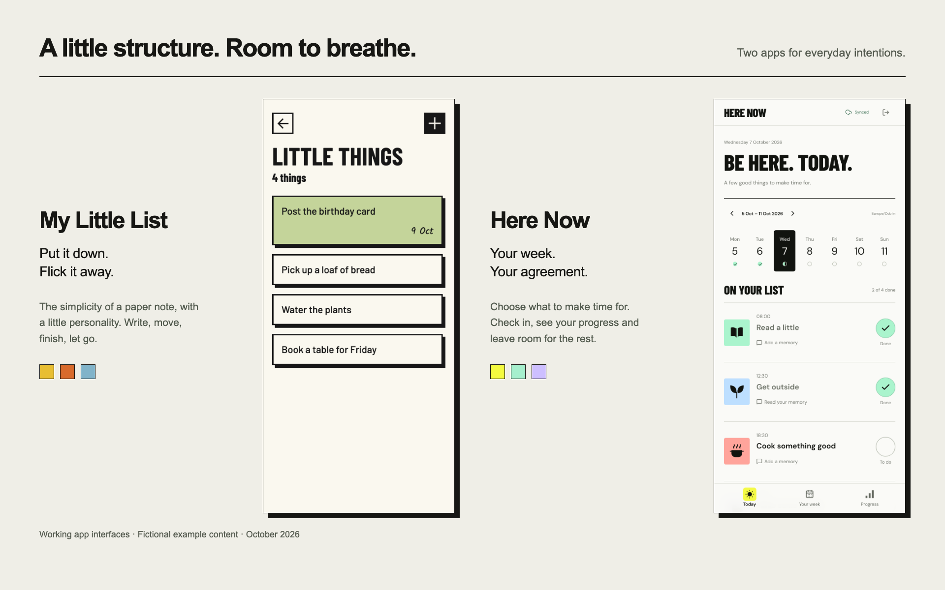
Working interfaces · Fictional examplesReal screens from the current web apps, captured locally with sample lists and activities. The presentation brings the two visual identities together; neither app is currently open for public access.

CONTEXT

Setting up a to-do app often felt like starting a project-management system. I wanted the equivalent of a piece of paper or a Post-it on the wall: somewhere to write what needed doing, then flick it away. Here Now grew from a related wish to make a small, deliberate agreement with myself about my week.

MY CONTRIBUTION

I shaped two complementary experiences around that premise: the tactile, playful lists of My Little List, and the bold weekly rhythm of Here Now. The work connects visual identity, everyday interactions and a deliberately limited set of jobs for each app.

WHAT IS TRUE NOW

Both apps have working web implementations deployed for private use. My Little List supports editable, movable lists and items; Here Now supports recurring activities, daily check-offs and weekly progress. The screens shown here use fictional examples.

  • Keep the interaction small
  • Let personality serve the task
  • Make room to stop

MY LITTLE LIST

A piece of paper, with a little personality.

The starting point was a familiar frustration: I would open a to-do app to organise a few things and end up organising the app itself. My Little List keeps the paper-note idea close. Write something down, keep it in view and flick it away when you are finished.

Straight paper cards, hard shadows and expressive colour give that small action a sense of fun. Retro, Pop and Mono themes let the same simple interface feel different without asking the user to learn a new system.

The physical metaphor carries through to interaction: hold to lift, move to reorder, flick to remove. An Undo gives a removed card a way back, and keyboard-accessible controls offer alternatives to the gestures. The playfulness needs to remain practical.

HERE NOW

A small agreement with yourself.

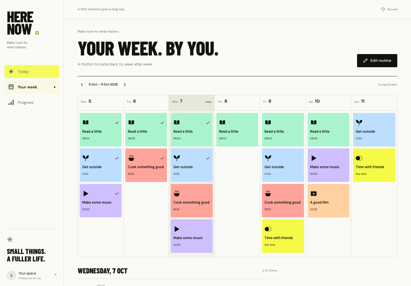
Here Now gives the same ethos a weekly rhythm. You choose the activities you want to make time for and the days on which you intend to do them. Today, Your week and Progress each answer a simple question: what is here now, what have I planned, and how has the week gone?

Daily check-offs build a picture of what you have engaged with. Completed and planned counts make that picture concrete, including a distinction between the full week's plan and what was planned through today. Future commitments should not read as things you have already missed.

The tone I wanted was matter-of-fact and without judgement. A record of the week can acknowledge effort and help you reflect without making an unfinished activity a verdict on the day.

VISUAL DESIGN

Simple can still have character.

Minimalism here is about how much the interface asks of you. My Little List uses colour, paper-like surfaces and movement to make a modest utility feel funky, fresh and enjoyable.

Here Now carries that confidence into a neo-brutalist direction: emphatic type, visible borders, strong contrast and blocks of colour. The visual weight gives a small set of activities a clear place on the screen, while the navigation stays close to the day, the week and its progress.

The two apps share a point of view, but each has its own job. A list catches the loose things in your head. A weekly plan holds the commitments you want to return to.

THE DESIGN INTENTION

A clear place to stop.

The feeling I was designing towards was satisfaction: being able to look at the day or week and recognise that I had followed through on what I chose. Having a visible agreement can make it easier to know when enough is enough and let the time in between belong to something else.

Rest does not need to be earned through a perfect checklist. The ambition is to reduce the mental noise around unfinished intentions and give people a little more room to relax. That is the premise behind these apps; whether they create that experience for others still needs to be tested.

EVIDENCE & BOUNDARIES

  • The current implementations support the list, scheduling and progress interactions described here. Captures were made locally on 7 October 2026 using fictional lists and activities, with no personal plans or memories included.
  • Both hosted apps are private. This page is a design case study, not an invitation to a public demo; private source repositories and owner-only app destinations are not linked.
  • My Little List keeps list content in the current browser. Here Now saves an authenticated account's weekly plan online. They are separate apps with a shared design ethos, not a connected or synchronised product suite.
  • The desired feeling of satisfaction and permission to switch off is the product premise. It is not a measured behavioural or wellbeing outcome.

WHAT I CARRY FORWARD

Do what you meant to do. Leave room for the rest.

These apps are an exercise in keeping the product close to the original need. The visual character makes them enjoyable to use; the limited scope gives the interaction a stopping point. The next question is whether that balance feels as useful to other people as it does in the original premise.

Explore all selected work